Report
Introduction
Purpose
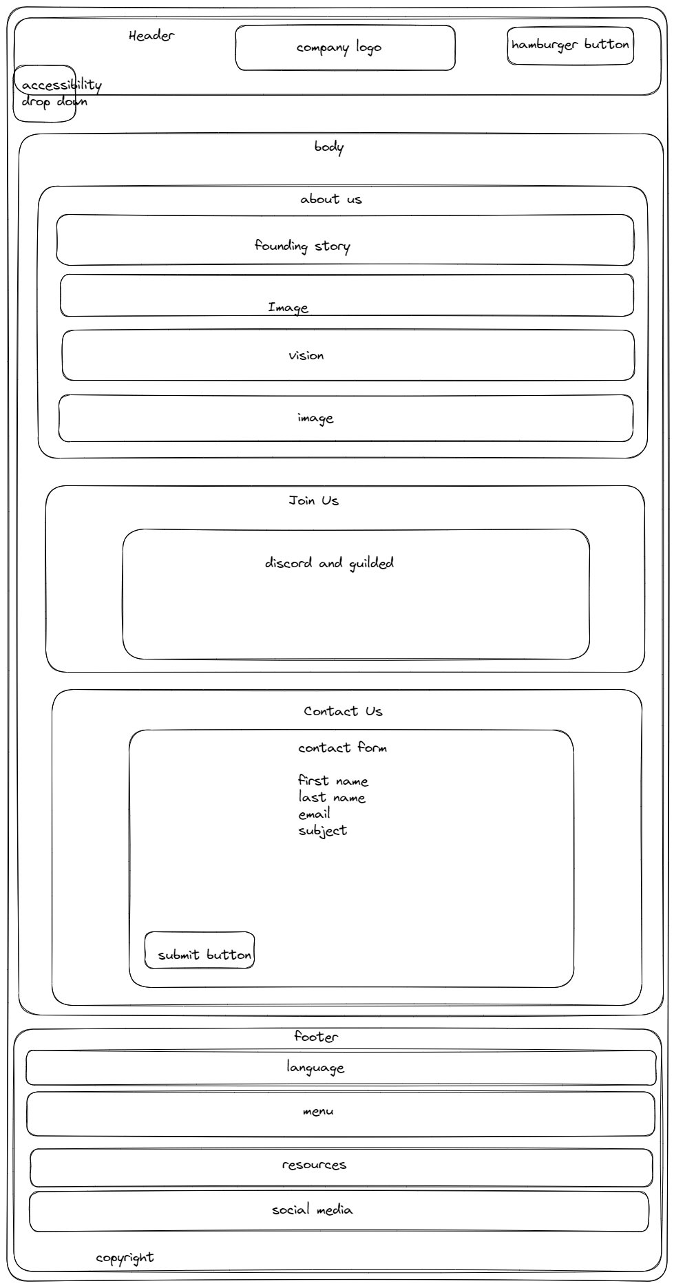
I believe this is rather self explanatory. The goal of the website is to promote ninth generation Pokemon game set in Paldea and provide coverage of events happening around the game. This is not limited to in game event, official event or community related such as donation drive. The target demographics ranged from people who have heard of the game but don't play it to veterans. As mentioned in "About Us", this generation of Pokemon game is perfect for people who hates the grind but love competitive PvP as most of the grind can be easily skipped with items easily obtained in game.
Structure
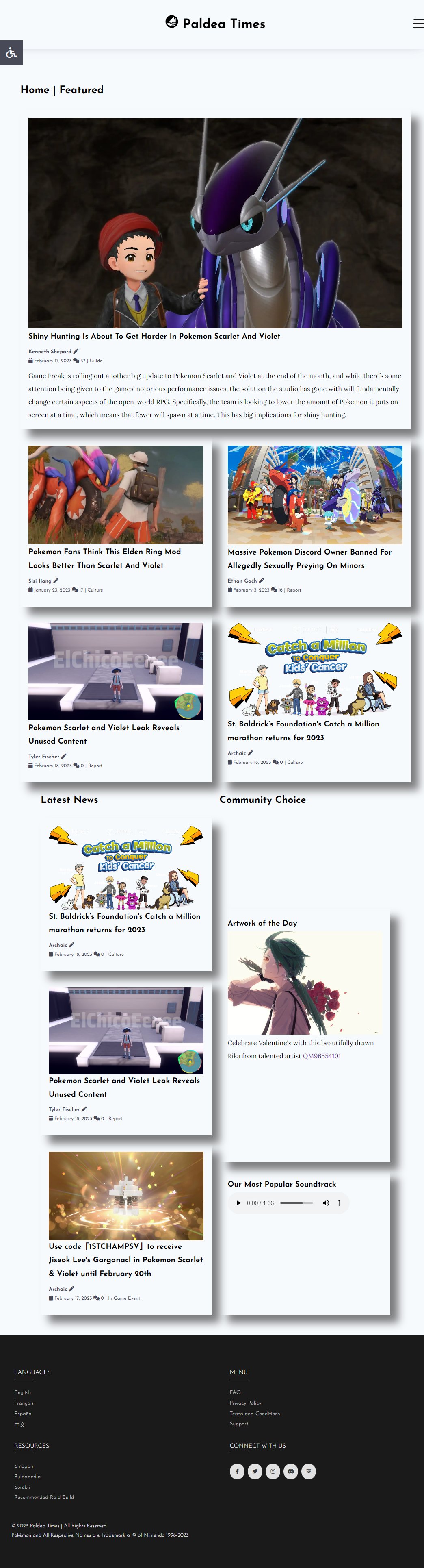
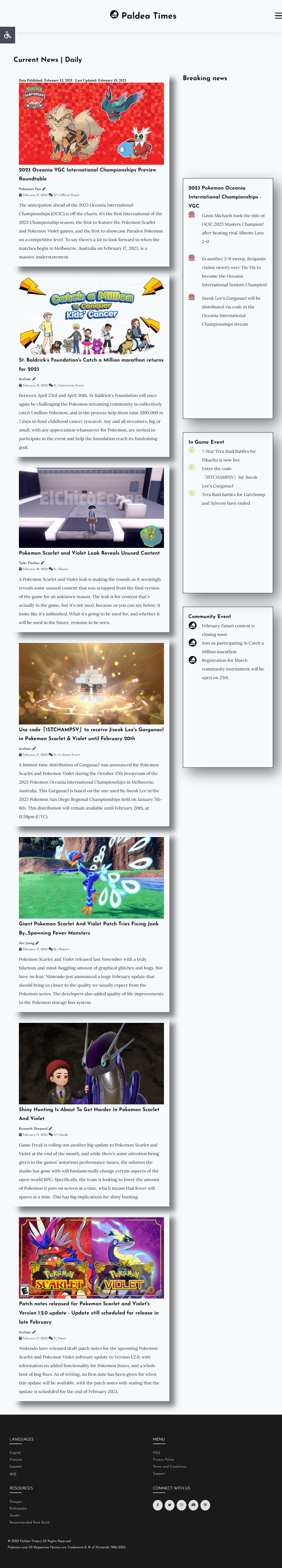
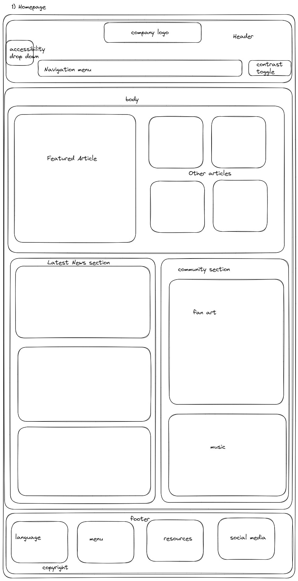
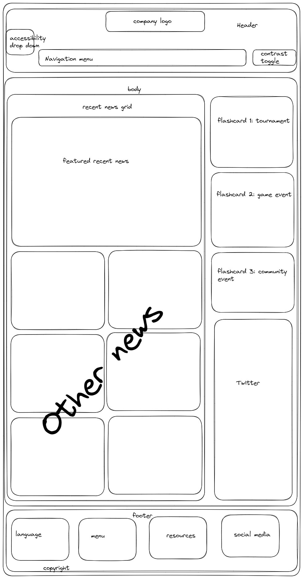
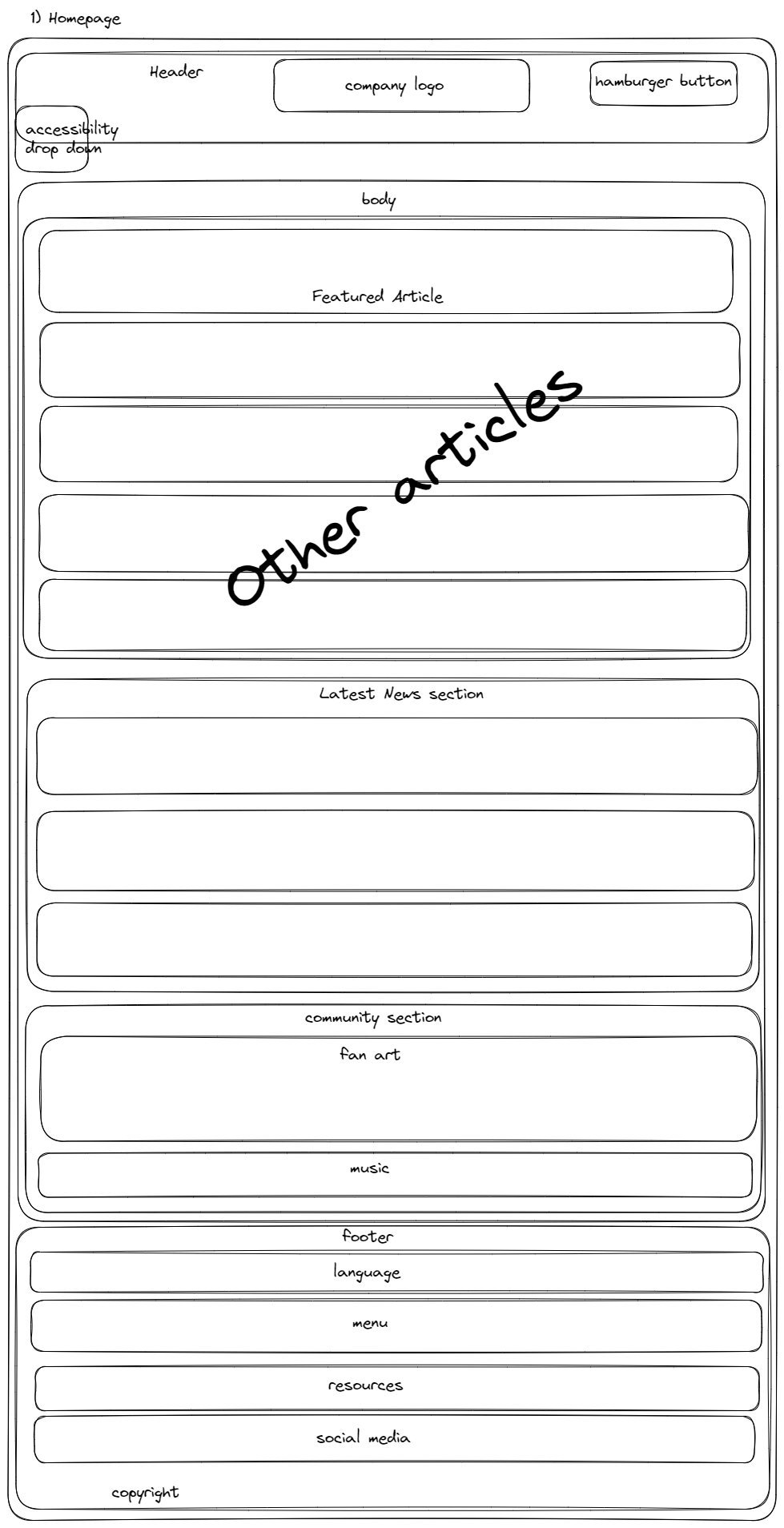
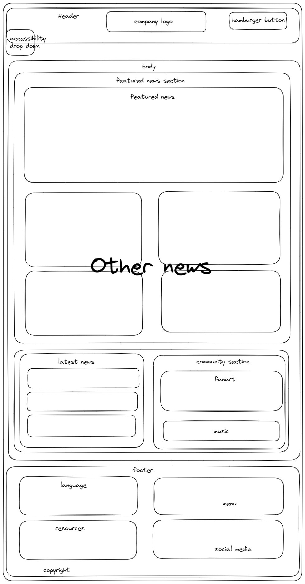
The first two page "Home Page" and "Curent News" are made to look like magazine to fit the given task.
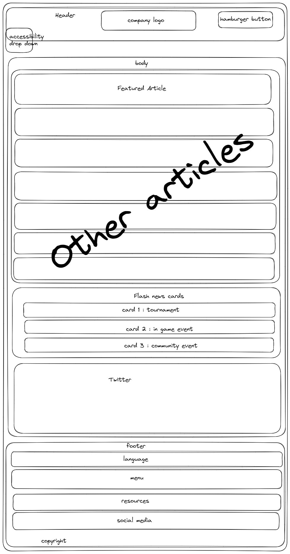
Both page have slightly different format, with the "Home Page" denser like newspaper or magazine home
page while "Current News" page is simpler version with "Flash News" card added on the side.
A lot of time were spent thinking how to make it not too dense and overload the page. This was the
structure I came with after looking at more websites.
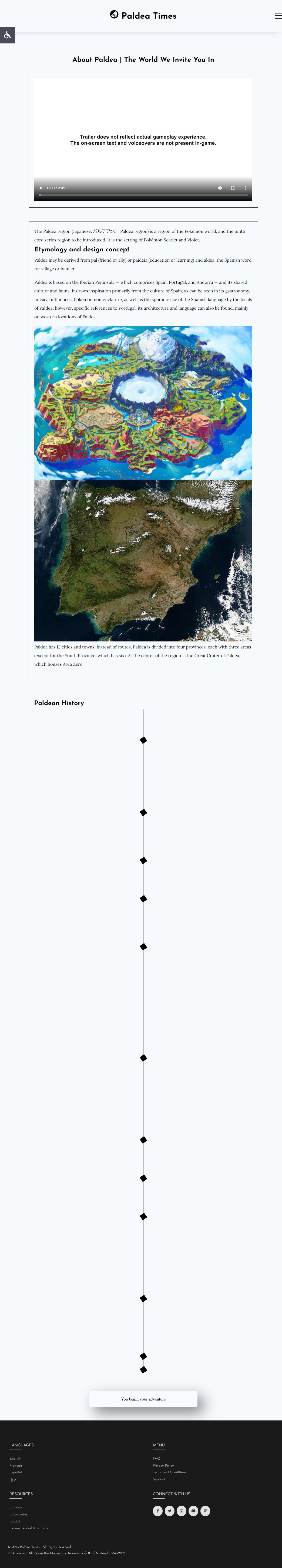
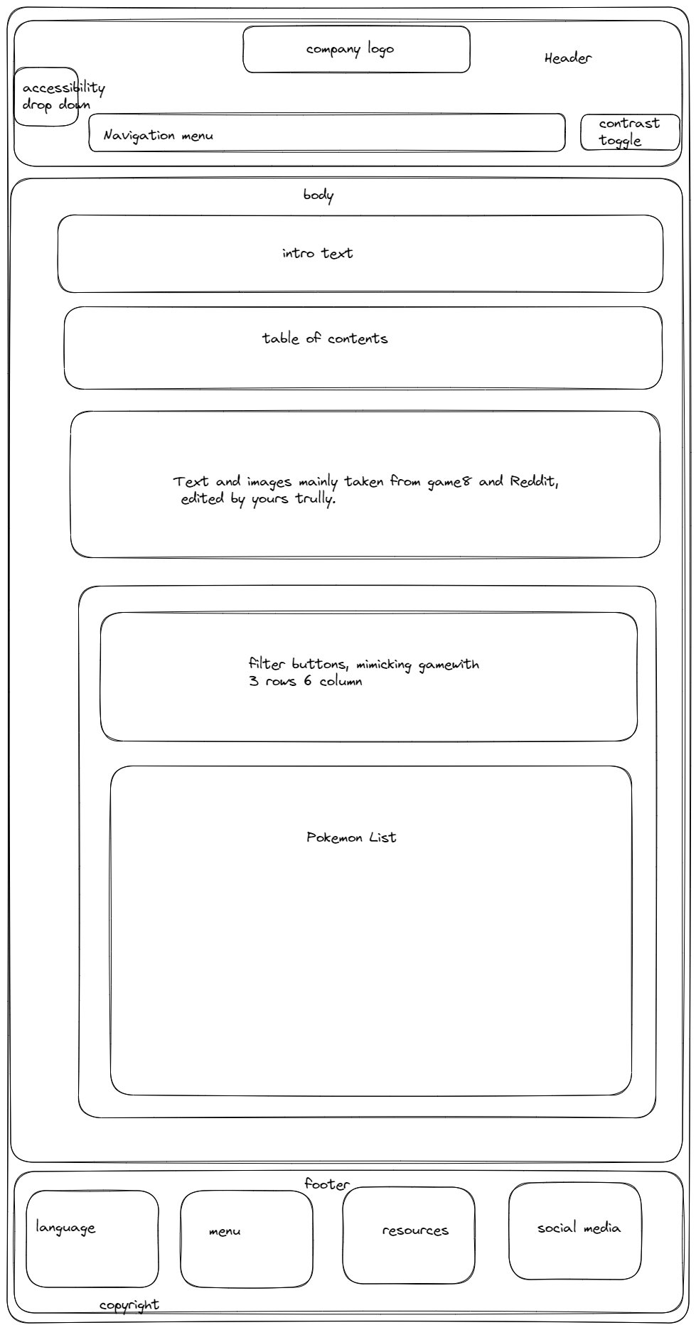
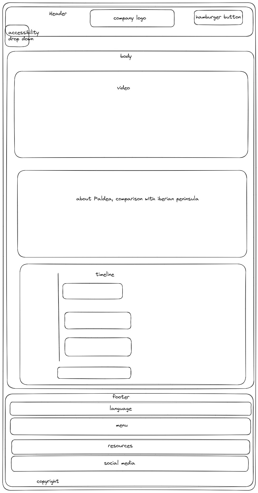
"Raid Guide" and "About Paldea" are inspired by old design of wikipedia webpages and article pages that
usually only use the center part of the space and leave the sides blank.
More details about the inspiration source of the structure would be explained in the next section.
Inspiration
Barring some of the past years submission (because otherwise I don't know what to do and what is expected), these are the main source of inspiration.
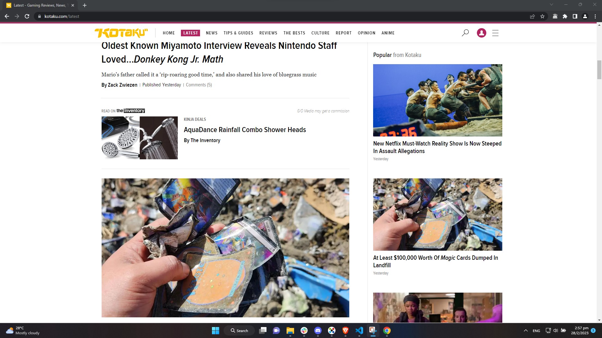
Kotaku
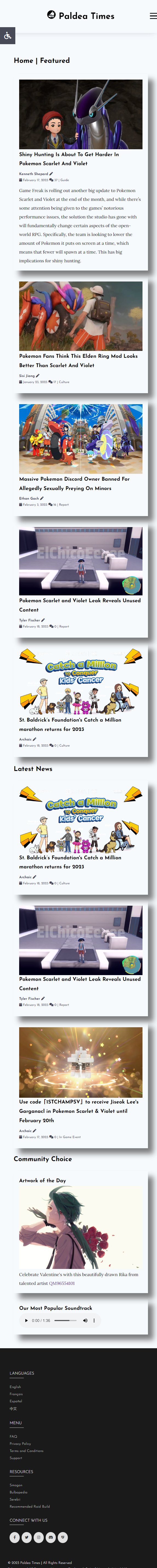
While I often find the articles published disagreeable, I find the layout of the website rather appealing. In fact, the design of "Home Page" and "Current News" are partially based on Kotaku. The top part of the "Home Page" is designed after Kotaku "Home Page" with "Featured News" on the left, occupying roughly the same space as 4 articles on the right. Having larger portion for "featured section" brings more attention to it.
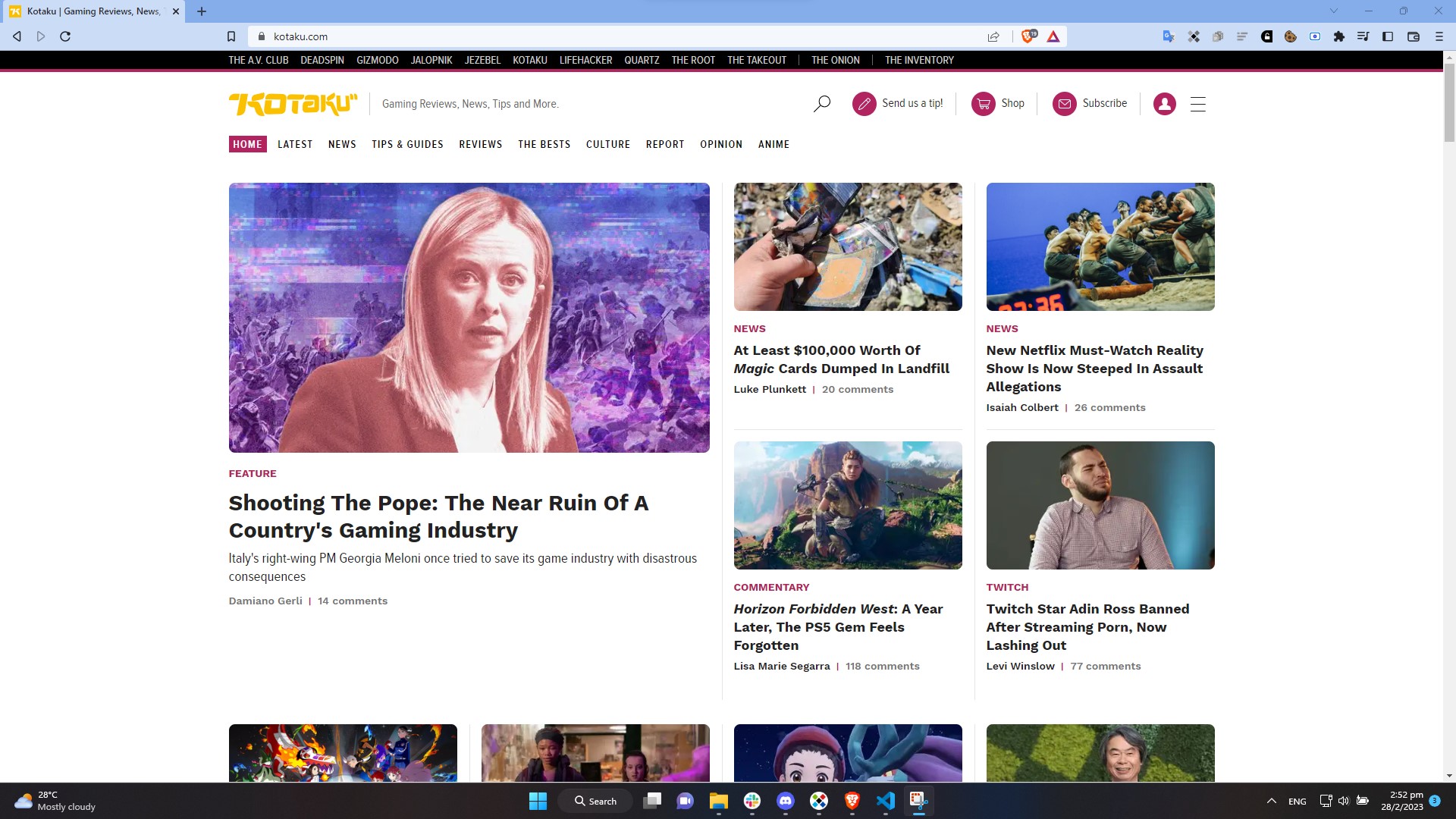
Below "Featured News" there are two articles, that is where the idea for "Current news" section come from, combined with "Popular News" flash card on "Latest News" page which I repurposed as text only "Breaking News".
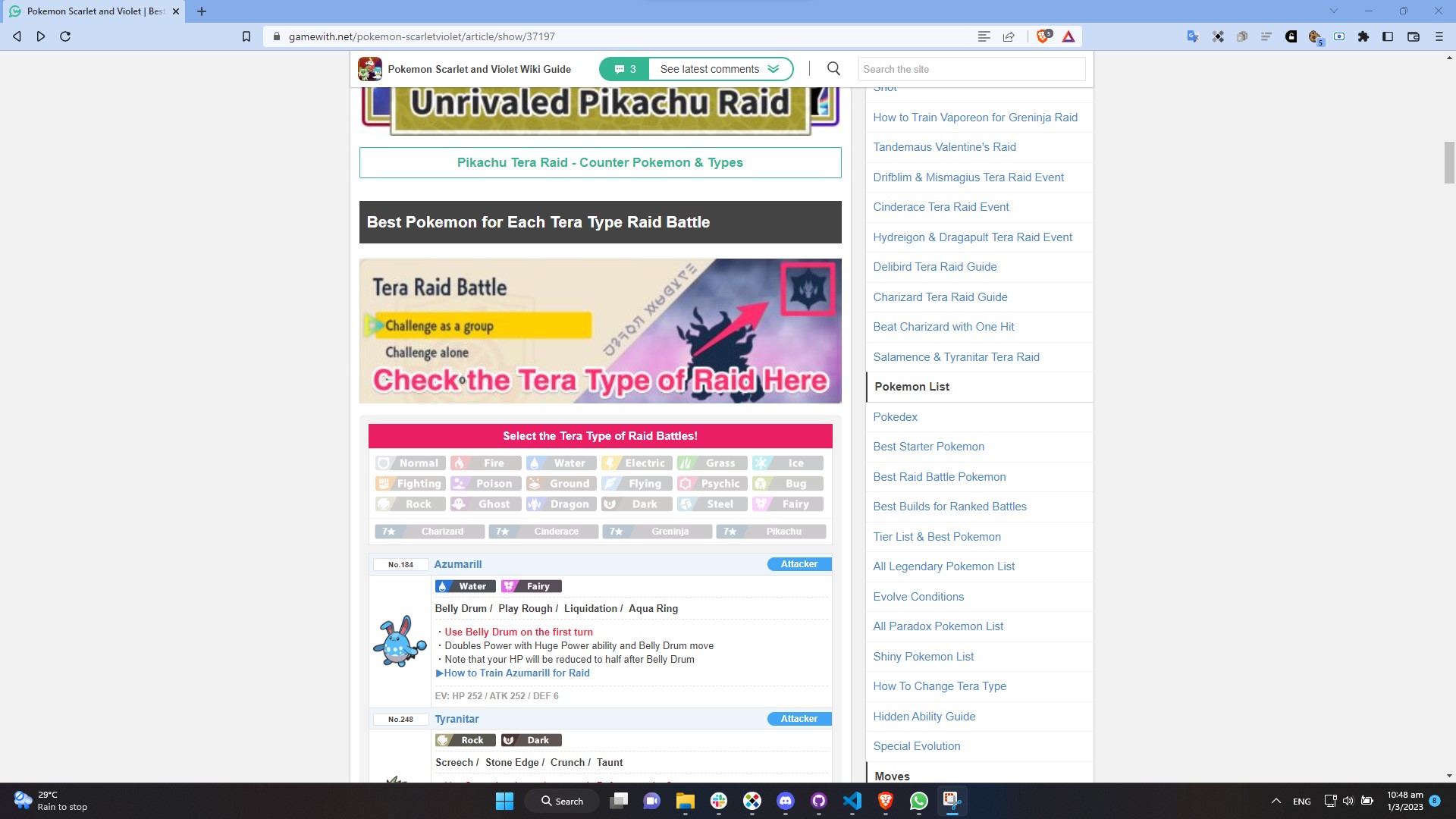
Gamewith
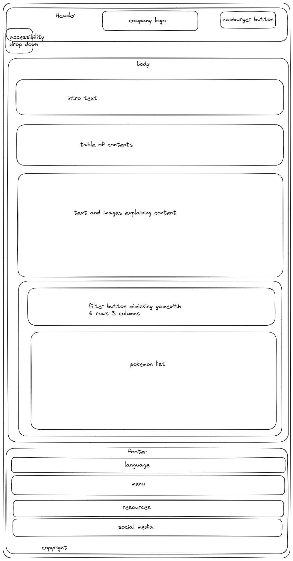
Gamewith is a Japanese gaming site. Although it also provide content in English, sometimes translation artefacts are still remaining. A typical Gamewith page usually has a centered fixed size container divided into two unequal column with the left side containing the main article and the right side having contents that link to other articles, advertisement and even links to other games. I decided to not replicate their right side because I find it rather distracting. So I only have the main article body for "Raid Guide" and "About Paldea" page. Another thing that I tried to replicate from Gamewith was the filter buttons at the bottom of "Raid Guide" Page. You can take a look at the original by clicking this link.
WCAG Accessibility Standards
Thinking about web accesibility is a headache, WCAG Accessibility Standards provided a guideline what
could be done to make website accessible.
From the start of the project, making the website accessible to people with disablity is kept in mind.
For example, to make sure that the website is accessible, we keep the colour scheme as simple as
possible with mostly in the grayscale. This would make it easier for colour blind individuals. The
implementation of a contrast toggling button took colour contrast compliance into account, with a low
contrast mode that caters to dyslexic individuals. We would elaborate more on accesibility in the next
section.
Acessibility
Accessibility dropdown menu
Wheelchair symbol is used to indicate the accessibility dropdown menu to make it easier to
recognise.
The first accessibility option uses an objectively legible font, Arial to represent all font families on
the web page. The purpose of the button is to change fonts used on the webpages, between Serif Fonts and
Sans Serif Fonts. There are studies that demonstrate how serif fonts are actually superior to sans serif
in many long texts (Arditi & Cho, 2005). And there are studies that support sans serif
typefaces as superior for people living with certain disabilities (such as certain visual challenges and
those who learn differently; Russell-Minda et al., 2007). Having a toogle button helps us to cater both
groups.
The second accessibility option underlines links on the page. Underlining is traditionally used to
indicate link, however this can be easily confused as emphasis which could lead to misunderstanding of
intent. Having a toogle button to underline links and not would help people with learning disability and
those unfamiliar with technology to identify them.
The third accessibility option offers a grayscale mode, which removes bright and distracting saturated
colours for general users and improves readability for colour-blind users. This would further reduces
eye strain under low light conditions, especially for dense blocks of text. It is also helpful for users
who access the website with e-ink screen devices like Nook or Amazon Paperwhite.
Each accessibility option button is accompanied by a corresponding high-contrast tooltip that
clearly indicates the accessibility feature. This user-triggered GUI element becomes visible when a
mouse-hover gesture is detected and provides a brief, temporary description that does not collide with
critical main content elements.
Contrast toggle button for legibility
Our default colour scheme is a white background with black lettering which is high contrast. Human eyes
distinguish the best if white appears on a black background and vice versa. Hence, the contrast ratio
should be higher for the eyes to lessen the stress on the eyes. This is ideal for visitors with visual
impairments who would find it harder to read at low contrast, such as grey test on a dark grey
background.
Lower contrast on the other hand would benefits those with learning disability. For example, dyslexic
individuals could read more efficiently, due to reduced variation in hues, saturation, and brightness.
Back-to-top button to reduce vertical scrolling
Vertical scrolling could be a daunting task for those with motor disability, especially older individuals with arthritis. Back-to-top button also can help people with mobility issues navigate the page more easily, it reduces strain on fingers and wrist. It also helps people to save time. The back to top button is especially helpful for people using mobile devices. It decreases the swiping they have to do to get back to the top of a page.
Usability
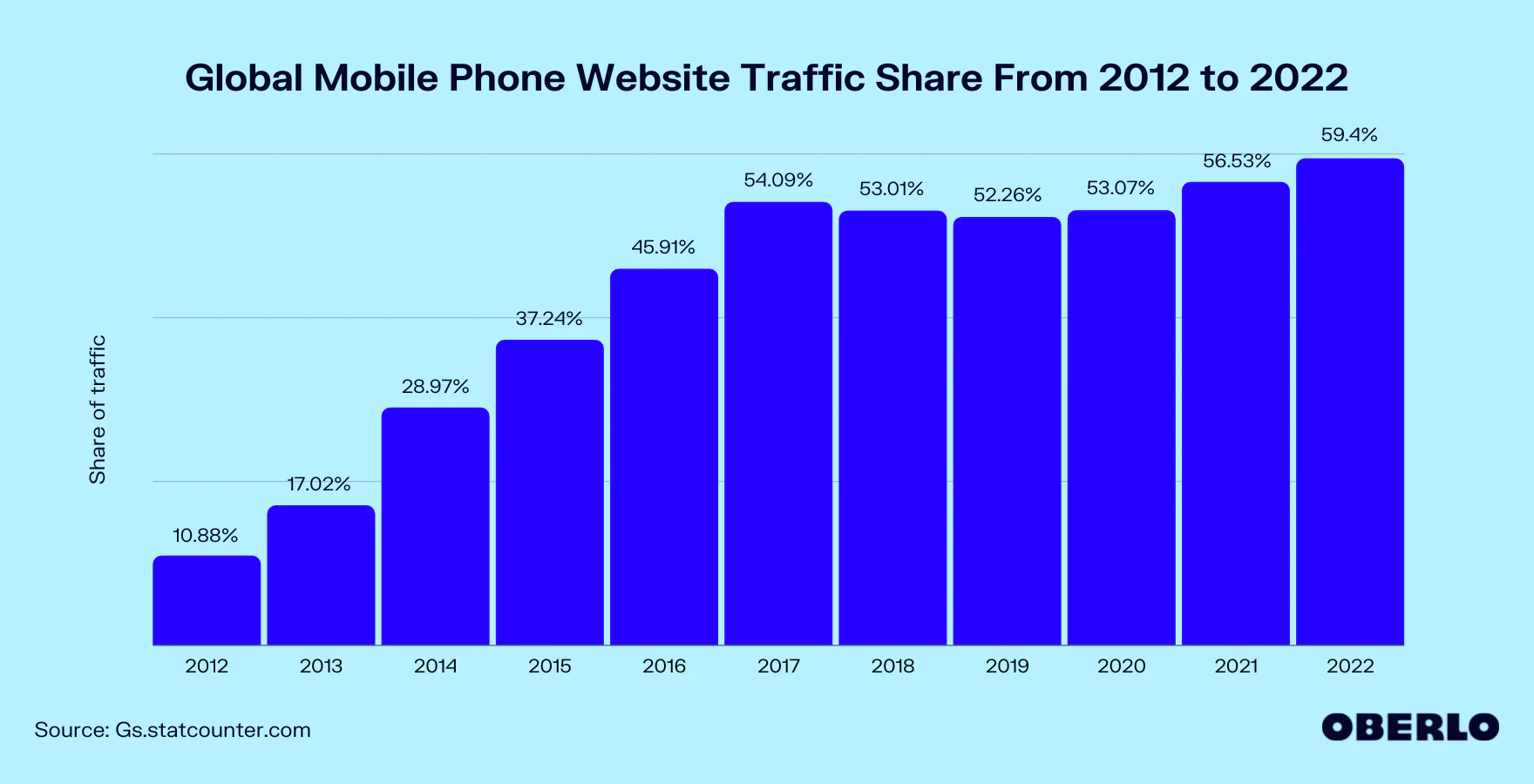
Responsive layout and a toggleable hamburger menu to accommodate smaller screen sizes
The share of global web traffic on mobile phone has soared over the decade. It was a mere 10.88% in 2012 and by 2017 it have risen fivefold to 54.09%. Therefore, it is critical to design a website with smaller screen in mind.
The hamburger menu is easily the most recogniseable button in mobile interface. It strategically
organize navigation buttons into a single column and improves overall clickability. With the hamburger
menu, we can have clean, compact and organized navigation and thus maintain overall readability on
smaller screens. Without responsive design to alter our webpage, the navigation button would collide,
making it difficult to navigate between pages.
Website layout also has to be changed to prevent collision, reduce clutter and maintain readability.
This was done by moving sidebar or completely remove them on smaller resolution.
Colour Scheme
Colour Scheme choice, header and footer are clean and consistent across all pages, making it easier for visitors to grow familiar and leave a lasting impression. It also help them to not get lost while navigating pages.
Timeline
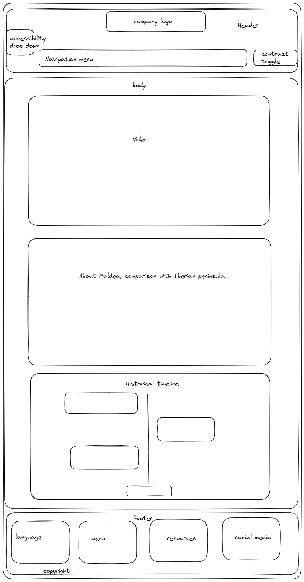
Vertical timeline is a powerful tool to visualize "historical event". I believe the use of vertical timeline helps in understanding the flow of event.
Learning Outcome
Throughout the project, one of the things I have learned is animating with CSS. CSS could be used to transform page elements, such as moving, enlarging, fade, rotation and more complicated animation like swimming koi fish which can be done with help of javascript. For this project, I built an animated vertical timeline.
Web accessibility is kept in mind from the start. I read through WCAG Accessibility Standards and asked around people in the industry what I should consider. The idea from that was to make the webpage colour-blind friendly and reduce mouse use as much as possible. From there we went on with legibility, underlining, grayscale filter and contrast toggle button.
This project is also the first time I build filter buttons. Although it is not a foreign concept to me, the code caused conflict and had me scratching my head for days to find out what killed my event listener.
What Worked Well
Accessibility Menu and Contrast Toggle button worked well on web site content. However, I couldn't manage to have it work on twitter element. This is probably because it is from an external source that loads later than everything.
The filter element worked well, as intended. More could be done to make it look better but I believe it is already good enough. It looks good enough to fit the simple design of the website.
Fitting the timeline for smaller screen wasn't easy. After some tinkering with sizes, I managed to make it work on smaller screen without overflow.
What Didn't Work Well
I tried to implement a horizontal timeline for 'company history' but I couldn't decide the design and how it would adapt to screensize so I dropped the idea.
The webpages likely will break on extremely wide screen. I couldn't test and adjust it myself as I have no access to those screens.
The webpages are too bland. I would like to add more interactive elements and animations if I am given more time. One of the scrapped idea was a loading screen.
Resources
oberlo.com, 'WHAT PERCENTAGE OF INTERNET TRAFFIC IS MOBILE?', 2022. [Online]. Available: https://id.oberlo.com/statistics/mobile-internet-traffic [Accessed: 2-Mar-2023]
K.Shepard, 'Shiny Hunting Is About To Get Harder In Pokemon Scarlet And Violet', 2023. [Online]. Available: https://kotaku.com/pokemon-scarlet-violet-shiny-patch-switch-auto-updates-1850127744 [Accessed: 18-Feb-2023]
S.Jiang, 'Pokémon Fans Think This Elden Ring Mod Looks Better Than Scarlet And Violet', 2023. [Online]. Available: https://kotaku.com/pokemon-scarlet-violet-elden-ring-mod-legends-arceus-1849944647 [Accessed: 18-Feb-2023]
E.Gach, 'Massive Pokémon Discord Owner Banned For Allegedly Sexually Preying On Minors', 2023. [Online]. Available: https://kotaku.com/pokemon-subreddit-discord-sexual-predator-minors-banned-1850072117 [Accessed: 18-Feb-2023]
T.Fischer, 'Pokemon Scarlet and Violet Leak Reveals Unused Content', 2023. [Online]. Available: https://comicbook.com/gaming/news/pokemon-scarlet-violet-leak/ [Accessed: 18-Feb-2023]
Archaic, 'St. Baldrick’s Foundation's Catch a Million marathon returns for 2023, asking streamers to catch 1 million Pokémon to support kids cancer research', 2023. [Online]. Available: https://bulbagarden.net/threads/296183 [Accessed: 18-Feb-2023]
Archaic, 'Use code「1STCHAMPSV」to receive Jiseok Lee's Garganacl in Pokemon Scarlet & Violet until February 20th', 2023. [Online]. Available: https://bulbagarden.net/threads/296173 [Accessed: 18-Feb-2023]
QM96554101, 2.14, 2023. [Online]. Available: https://www.pixiv.net/en/artworks/105548643 [Accessed: 18-Feb-2023]
Pokemon.com, 2023 Oceania VGC International Championships Preview Roundtable, 2023. [Online]. Available: https://www.pokemon.com/us/pokemon-news/2023-oceania-vgc-international-championships-preview-roundtable [Accessed: 19-Feb-2023]
S.Jiang, Giant Pokemon Scarlet And Violet Patch Tries Fixing Jank By…Spawning Fewer Monsters, 2023. [Online]. Available: https://kotaku.com/pokemon-scarlet-violet-nintendo-switch-bug-patch-1850127808 [Accessed: 19-Feb-2023]
Archaic, 'Patch notes released for Pokémon Scarlet and Violet's Version 1.2.0 update - Update still scheduled for release in late February', 2023. [Online]. Available: https://www.bulbagarden.net/threads/296171 [Accessed: 18-Feb-2023]
gamewith.net, 'Best Pokemon For Tera Raid Battles & Team Raid Tips', 2023. [Online]. Available: https://gamewith.net/pokemon-scarletviolet/article/show/37197 [Accessed: 20-Feb-2023]
game8.co, 'Tera Raid Tips and Battle Mechanics | Pokemon Scarlet and Violet (SV)', 2023. [Online]. Available: https://game8.co/games/Pokemon-Scarlet-Violet/archives/384344 [Accessed: 20-Feb-2023]
bulbapedia, 'Paldea', 2022. [Online]. Available: https://bulbapedia.bulbagarden.net/wiki/Paldea [Accessed: 23-Feb-2023]
Nintendo UK, 'Pokémon Scarlet & Violet - Welcome to the Paldea region! (Nintendo Switch)', 2023. [Online]. Available: https://youtu.be/kdju_9bGMv8 [Accessed: 22-Feb-2023]
Arditi and Cho, 'Serifs and font legibility', 2005. [Online]. Available: https://www.sciencedirect.com/science/article/pii/S0042698905003007 [Accessed: 28-Feb-2023]
Russell-Minda et al., 'The Legibility of Typefaces for Readers with Low Vision: A Research Review', 2007. J Vis Impair Blind. 101. 10.1177/0145482X0710100703.
imperialtrace, 'You can just "Press A" your way through 9 out of 18 Raid types with these three Pokemon', 2022. [Online]. Available: https://www.reddit.com/r/PokemonScarletViolet/comments/znhnpz/you_can_just_press_a_your_way_through_9_out_of_18 [Accessed: 20-Feb-2023]
References
Throughout the project, these websites have been specially helpful
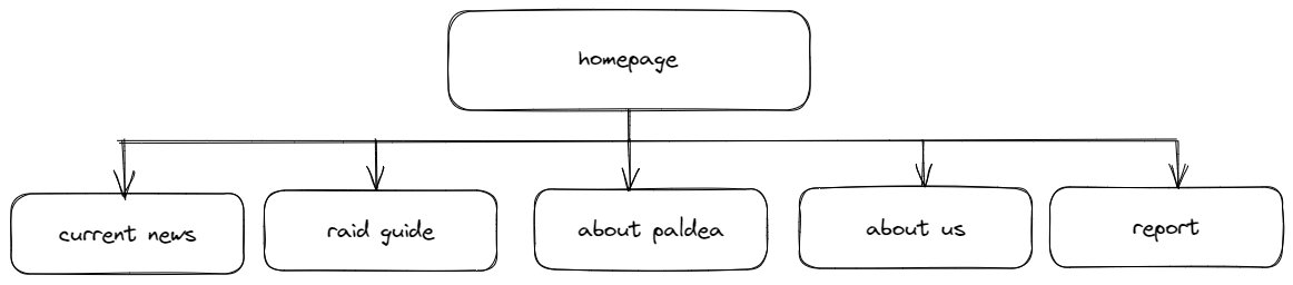
Site Map
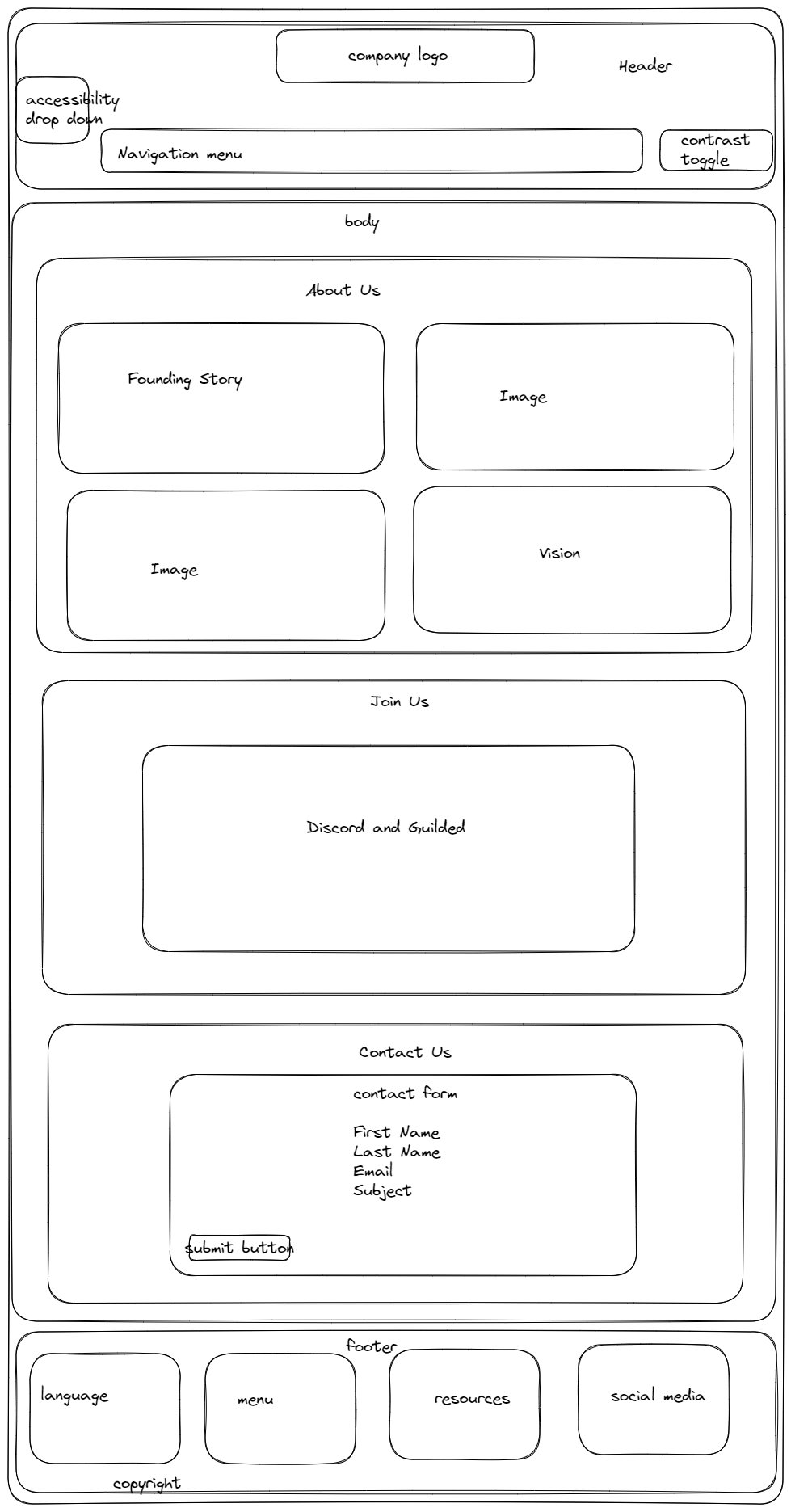
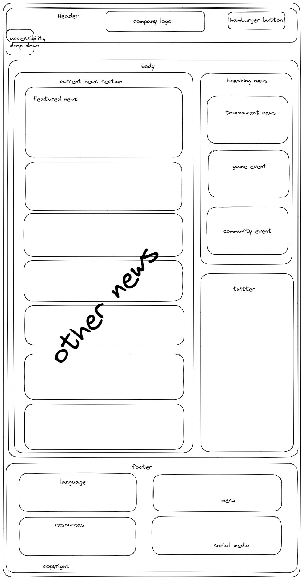
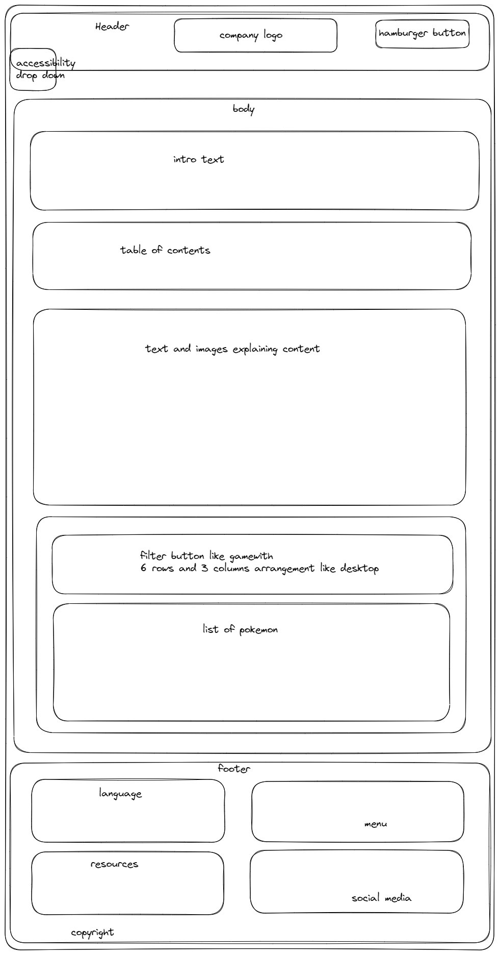
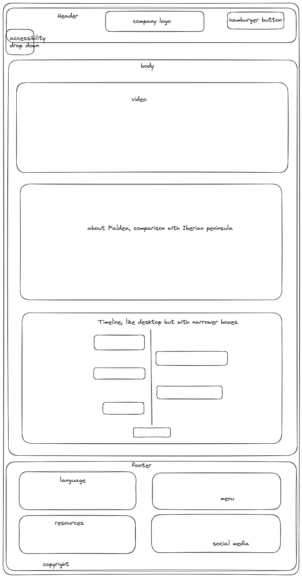
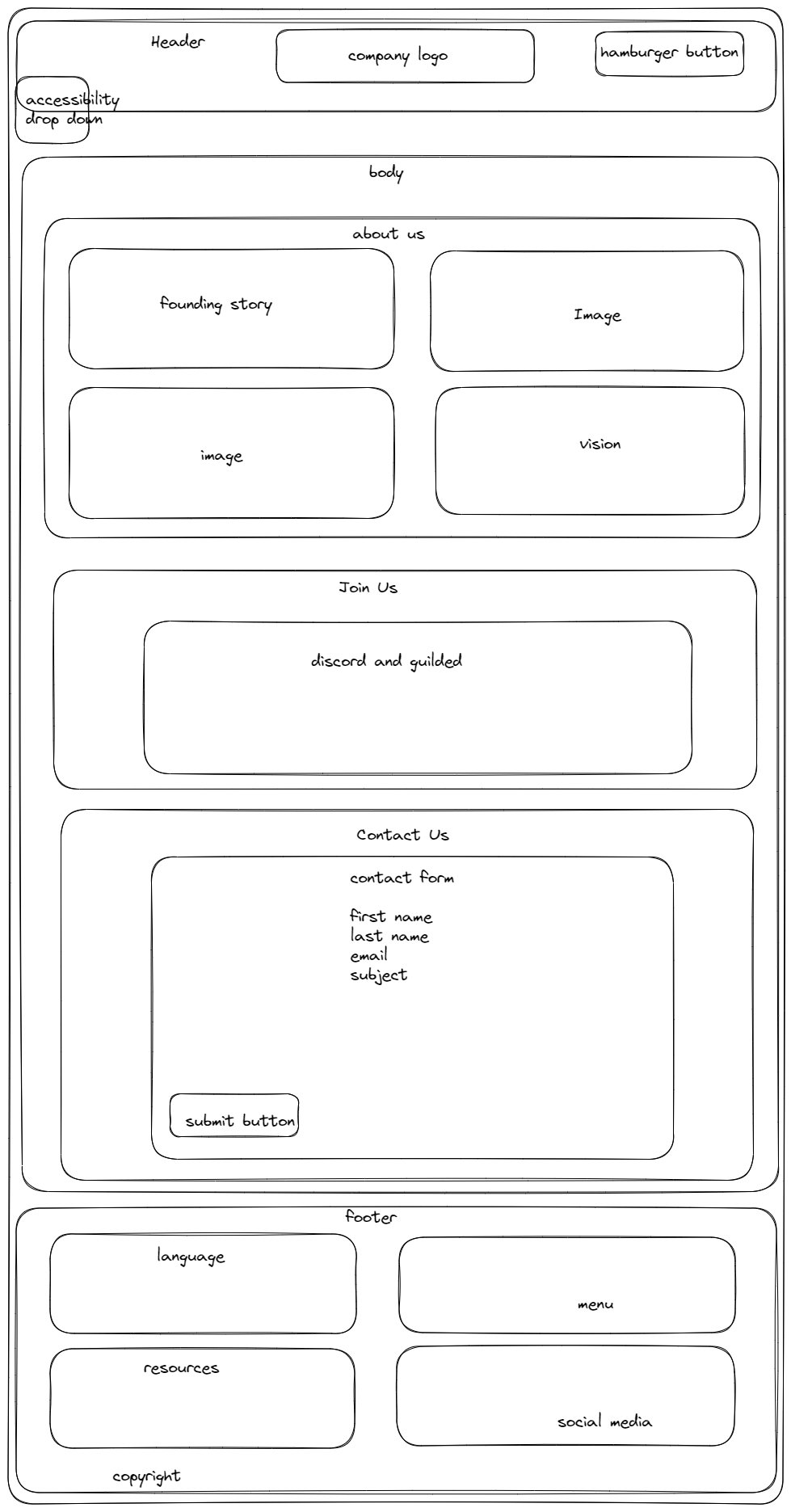
Wireframes
I used Excalidraw for this, sizes are not to scale. A lot of changes and adjustment were made during the project but the idea remain the same.
Desktop
Mobile
Tablet
Mock Ups
Please note that certain elements like embed Twitter posts and animated timeline do not appear correctly.
Desktop

Mobile


Tablet